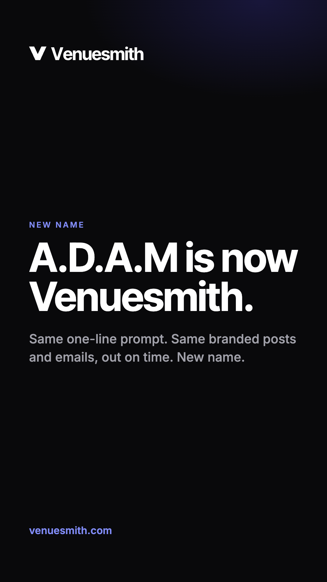
The Venuesmith brand.
Venuesmith writes, brands and schedules social posts and emails for pubs, bars, restaurants and cafes. These are the rules for showing the name, the logo, the colours and the type, and for how we sound.
One word, capital V.
Write Venuesmith as one word with a capital V, the same way the wordmark shows it. Never VenueSmith, Venue Smith or VS. The website is venuesmith.com. Venuesmith was previously called A.D.A.M.
Tagline: Marketing your venue, done before the doors open.
A sharp V.
The mark is a geometric V, for venue: two strokes cut at the same angle, meeting at a flat base. It is always one colour, Ink on light and White on dark. Use the lockup wherever there is room, and the mark on its own for app icons, avatars and favicons.


Keep clear space around the logo equal to the width of one arm of the V. The lockup should be at least 96px wide on screen and the mark at least 16px. Below 96px, use the mark on its own.
- Colour the V. It is Ink or White; Indigo appears only as an app icon background.
- Put the logo in a box, badge or outline that isn't one of the app icons.
- Retype the wordmark in another font, or stretch, rotate or outline the logo.
- Add gradients, shadows or glows, or place the logo on a busy photo.
Black, white and one indigo.
A quiet, neutral base of Ink, White and zinc greys, so a venue's own photos and colours do the talking. Indigo is the only accent: the main action on each screen, links and focus. Use it sparingly.
In the app, primary buttons are Indigo with white text in both themes (6.3:1). Links use Indigo on light (6.3:1) and Indigo Light on dark (6.4:1). All pass WCAG AA.
Inter Tight and Inter.
Headlines, page titles and the wordmark. Tight tracking, about -0.03em at large sizes.
Like a well-briefed manager.
Hospitality first, technology second. Lead with what happens for the venue, use specifics (times, places, numbers), keep sentences short and trust the operator. Venuesmith is a tool: talk about what it does, not how clever it is.
- No em or en dashes. Commas, full stops and colons do the job.
- No exclamation marks, and no "unleash", "supercharge", "game-changing" or "AI-powered".
- Plain hospitality words: bookings, covers, service, the bar.
A quiet table at the back of a busy room.
Real venues, real food and real glassware in warm, available light. Texture matters: condensation on a glass, the grain of the bar, a paper menu. No flash, no posed groups and no stock studio shots. Leave a quiet corner of the frame for text.
Files for print, web and social.
The brand kit has every logo file, the social images and a colour and type sheet. Inter Tight, Inter and JetBrains Mono are free under the SIL Open Font License from Google Fonts.